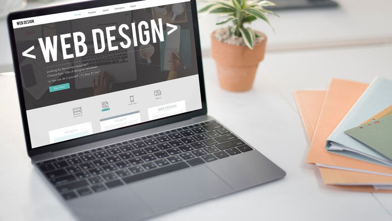
We have some exciting news and can’t wait to share it with you. We are giving our brand a little refresh and it all boils down to one factor: Craft. Build. Grow.
We’re passionate about the digital world – its where we get to craft modern solutions, build stunning visuals, and watch your business grow! But here’s the thing: we know the virtual world is not everything. Real connections are what make the difference. That’s why our new tagline, “Craft. Build. Grow,” goes together with our dedication to building and nurturing relationships. We don’t just dish out websites and campaigns – we collaborate with you, build your brand hand in hand, and enjoy its success with you.
So, Why the Change?
After years of dedicated service in the digital world, we realized it was time for our logo to adapt. We wanted our identity to reflect our boom, our passion for what we do and most importantly our commitment to you, our wonderful clients.
Same passion, new look!
So, while our logo has a whole new look and a lot of personality, our core values haven’t changed. Your success and happiness are always our top priority. We are more passionate than ever about delivering great digital solutions that take your business to the next level.
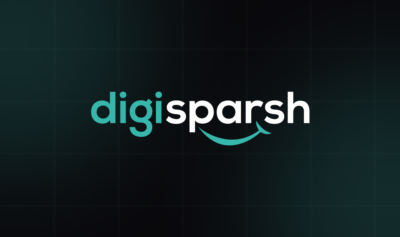
Our new logo says Hello!
Our logo has been redesigned and now features a friendly and welcoming smile. Take it as a picture of our amazing method and our will to build authentic connections with you. It’s more than just a business – we want to be your digital companion; a person you can accept as true and work with.
Our total makeover!
Well, it’s not just our logo that’s got a makeover. We’ve also revamped our entire brand identity. From a sleek modern classic font like Poppins to a subtle yet fresh color palette that includes light sea green and Brunswick green for a touch of nature’s energy, balanced by calming azure for a sense of professionalism. White keeps things clean and open, while jet black and eerie black add a touch of modern strength. Together, these colors create a dynamic and versatile look that grabs your attention.
Our Promise, Renewed.
Our revamp isn’t just about new colors, new fonts, new logos, or a new look. It’s about a renewed promise to take care of your brand as our own and nurture it to its full potential. All while providing services with a human touch.
Thank you for being a part of our journey, and for trusting us with your brand. We’re thrilled to continue building meaningful relationships and creating a space for you in this vast digital space.
Here’s to a bigger, more vibrant future together!
Love,
Kavita Saxena